
Julie Young
Leadership

Saudi Arabia
This project was an effort to update the vision of the city of Tabuk branding in Saudi Arabia, in support of a new master plan.
Tabuk, Saudi Arabia, has long served as gateway and resting point for Egyptian and Jordanian pilgrims. It is a region flush with natural springs and beautiful coasts. We developed two different lines of possible identity for Tabuk, one focusing on its long-recognized role as a gateway, and another focusing one Tabuk as an abundant wellspring.
Portal to the Oasis
Drawing from Tabuk’s existing identity as the “gateway,” this logo concept creates a portal to a lush oasis. This doorway, designed in a traditional Arabic shape, symbolizes new beginnings while respecting the artistic traditions of the region. The center of the logo mark is a date palm, a tree whose natural range stretches across the Tabuk province. Its fronds rise and fall to emulate the movement of a fountain while lush greenery at the base of the tree emulates the same movement.
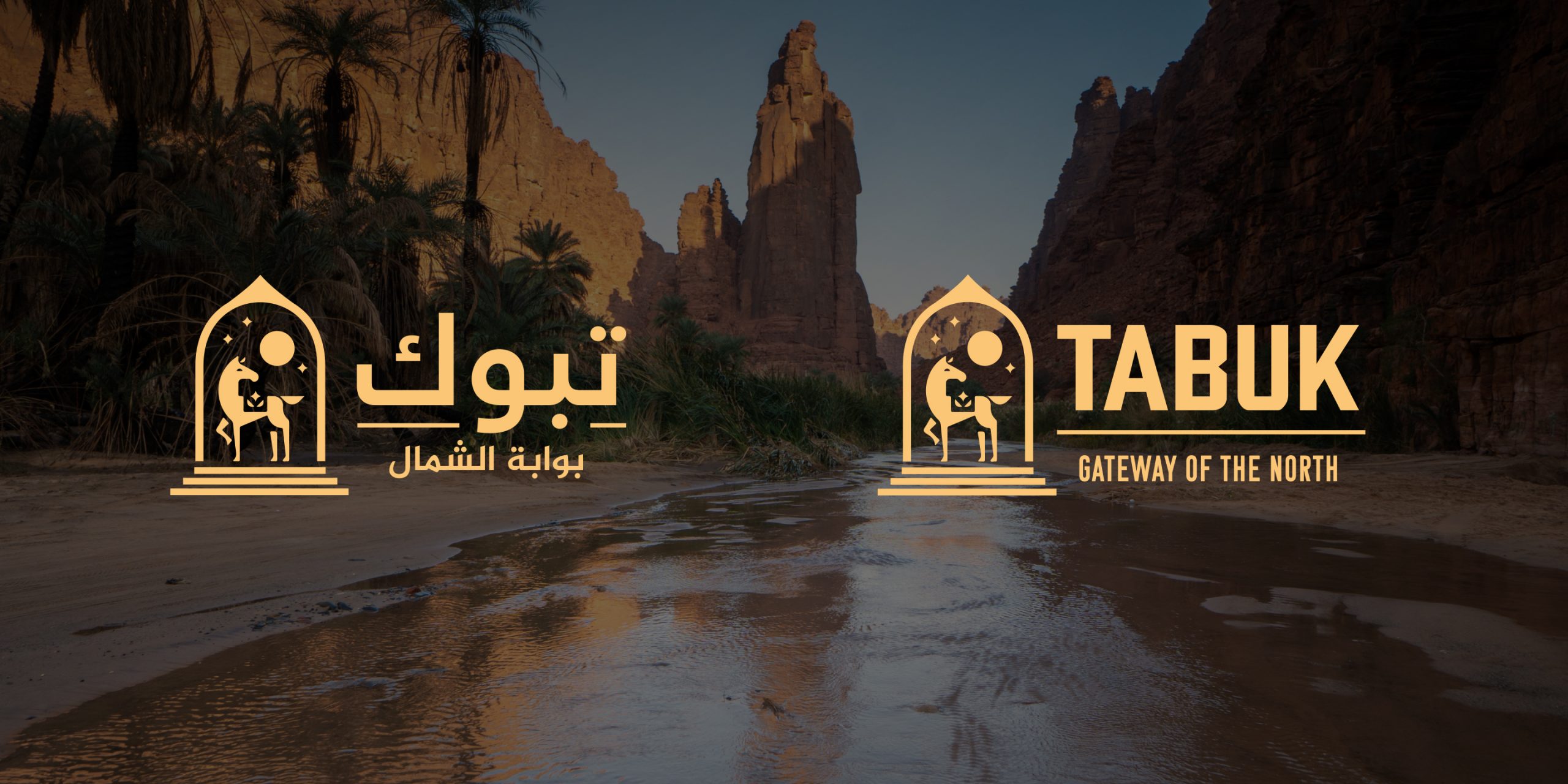
Gateway to History
For this concept, the famous gateway sculpture of Al Shamal is replicated in the frame of the logo mark. The steps leading up to Al Shamal are represented by the bold horizontal lines which also act to ground the logo. Inside the center of the arch stands a proud Arabian stallion, a modern interpretation of the dozens of petroglyphs of the region. Behind the horse, a full moon rises in the sky like a pearl in an azure sea.
Water Oasis
The Tabuk regions has several natural springs as well as 18% of Saudi Arabia’s sea coast, and such famous wells as Bir Haddaj, one of the largest wells in the Kingdom. The mark is created from droplets of water that continue around to form a circle, representing the continuous flow of water, both in and out of the well as it has been replenished for so many years. The logo mark is paired with a beautiful, English serif font with teardrop terminals.
project scope
Research, City Branding, and Logo Development
design services
Project Team